WPF渲染模板 电脑版发表于:2025/1/10 17:32  >#WPF渲染模板 [TOC] 简介 ------------ tn2>在WPF(Windows Presentation Foundation)中,渲染模板是一种强大的机制,允许开发者定义控件的外观和行为。 通过使用渲染模板,您可以完全控制控件的呈现方式,从而创建高度自定义的用户界面。 #### 简单示例 tn2>这里定义了一个`Button`至于你想显示什么,取决于`ControlTemplate`标签下定义了什么。 ```xml <Window x:Class="WpfAppLearning.StyleWin" xmlns="http://schemas.microsoft.com/winfx/2006/xaml/presentation" xmlns:x="http://schemas.microsoft.com/winfx/2006/xaml" xmlns:d="http://schemas.microsoft.com/expression/blend/2008" xmlns:mc="http://schemas.openxmlformats.org/markup-compatibility/2006" xmlns:local="clr-namespace:WpfAppLearning" mc:Ignorable="d" Title="StyleWin" Height="450" Width="800"> <Grid> <Button Content="Button" Width="100" Height="100" > <Button.Template> <ControlTemplate> <Label Content="xxxxx"/> </ControlTemplate> </Button.Template> </Button> </Grid> </Window> ``` 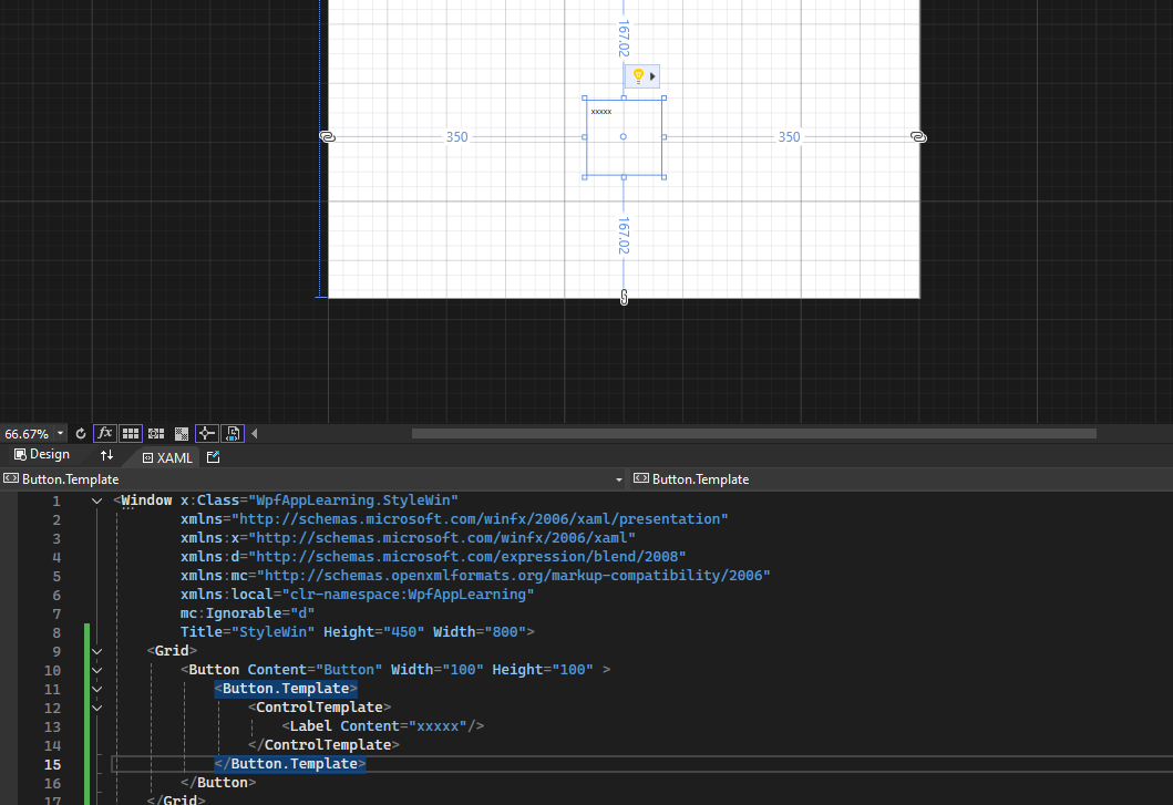 自定义模板 ------------ 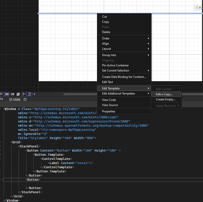 tn2>添加一个新的`button`并在选中后点击`Edit Template`-->`Edit a Copy`,创建键的名称并点击`OK`按钮。 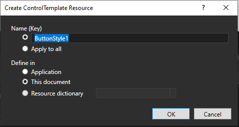 ```xml <Window x:Class="WpfAppLearning.StyleWin" xmlns="http://schemas.microsoft.com/winfx/2006/xaml/presentation" xmlns:x="http://schemas.microsoft.com/winfx/2006/xaml" xmlns:d="http://schemas.microsoft.com/expression/blend/2008" xmlns:mc="http://schemas.openxmlformats.org/markup-compatibility/2006" xmlns:local="clr-namespace:WpfAppLearning" mc:Ignorable="d" Title="StyleWin" Height="450" Width="800"> <!-- 定义全局资源 --> <Window.Resources> <!-- 定义焦点样式 --> <Style x:Key="FocusVisual"> <Setter Property="Control.Template"> <Setter.Value> <!-- 使用虚线矩形表示焦点 --> <ControlTemplate> <Rectangle Margin="2" StrokeDashArray="1 2" Stroke="{DynamicResource {x:Static SystemColors.ControlTextBrushKey}}" SnapsToDevicePixels="true" StrokeThickness="1"/> </ControlTemplate> </Setter.Value> </Setter> </Style> <!-- 定义按钮不同状态的背景色和边框颜色 --> <!-- 默认背景 --> <SolidColorBrush x:Key="Button.Static.Background" Color="red"/> <!-- 默认边框 --> <SolidColorBrush x:Key="Button.Static.Border" Color="#FF707070"/> <!-- 鼠标悬停背景 --> <SolidColorBrush x:Key="Button.MouseOver.Background" Color="#FFBEE6FD"/> <!-- 鼠标悬停边框 --> <SolidColorBrush x:Key="Button.MouseOver.Border" Color="#FF3C7FB1"/> <!-- 按下背景 --> <SolidColorBrush x:Key="Button.Pressed.Background" Color="#FFC4E5F6"/> <!-- 按下边框 --> <SolidColorBrush x:Key="Button.Pressed.Border" Color="#FF2C628B"/> <!-- 禁用背景 --> <SolidColorBrush x:Key="Button.Disabled.Background" Color="#FFF4F4F4"/> <!-- 禁用边框 --> <SolidColorBrush x:Key="Button.Disabled.Border" Color="#FFADB2B5"/> <!-- 禁用文字颜色 --> <SolidColorBrush x:Key="Button.Disabled.Foreground" Color="#FF838383"/> <!-- 定义自定义按钮样式 --> <Style x:Key="ButtonStyle1" TargetType="{x:Type Button}"> <!-- 设置焦点样式 --> <Setter Property="FocusVisualStyle" Value="{StaticResource FocusVisual}"/> <!-- 设置默认背景、边框和文字颜色 --> <Setter Property="Background" Value="{StaticResource Button.Static.Background}"/> <Setter Property="BorderBrush" Value="{StaticResource Button.Static.Border}"/> <Setter Property="Foreground" Value="{DynamicResource {x:Static SystemColors.ControlTextBrushKey}}"/> <!-- 设置边框厚度 --> <Setter Property="BorderThickness" Value="1"/> <!-- 设置内容对齐方式 --> <Setter Property="HorizontalContentAlignment" Value="Center"/> <Setter Property="VerticalContentAlignment" Value="Center"/> <Setter Property="Padding" Value="1"/> <!-- 自定义模板 --> <Setter Property="Template"> <Setter.Value> <ControlTemplate TargetType="{x:Type Button}"> <!-- 定义按钮外观 --> <Border x:Name="border" Background="{TemplateBinding Background}" BorderBrush="{TemplateBinding BorderBrush}" BorderThickness="{TemplateBinding BorderThickness}" SnapsToDevicePixels="true"> <!-- 显示按钮内容 --> <ContentPresenter x:Name="contentPresenter" Focusable="False" HorizontalAlignment="{TemplateBinding HorizontalContentAlignment}" Margin="{TemplateBinding Padding}" RecognizesAccessKey="True" SnapsToDevicePixels="{TemplateBinding SnapsToDevicePixels}" VerticalAlignment="{TemplateBinding VerticalContentAlignment}"/> </Border> <!-- 定义状态触发器 --> <ControlTemplate.Triggers> <!-- 默认按钮触发 --> <Trigger Property="IsDefaulted" Value="true"> <Setter Property="BorderBrush" TargetName="border" Value="{DynamicResource {x:Static SystemColors.HighlightBrushKey}}"/> </Trigger> <!-- 鼠标悬停触发 --> <Trigger Property="IsMouseOver" Value="true"> <Setter Property="Background" TargetName="border" Value="{StaticResource Button.MouseOver.Background}"/> <Setter Property="BorderBrush" TargetName="border" Value="{StaticResource Button.MouseOver.Border}"/> </Trigger> <!-- 按下触发 --> <Trigger Property="IsPressed" Value="true"> <Setter Property="Background" TargetName="border" Value="{StaticResource Button.Pressed.Background}"/> <Setter Property="BorderBrush" TargetName="border" Value="{StaticResource Button.Pressed.Border}"/> </Trigger> <!-- 禁用触发 --> <Trigger Property="IsEnabled" Value="false"> <Setter Property="Background" TargetName="border" Value="{StaticResource Button.Disabled.Background}"/> <Setter Property="BorderBrush" TargetName="border" Value="{StaticResource Button.Disabled.Border}"/> <Setter Property="TextElement.Foreground" TargetName="contentPresenter" Value="{StaticResource Button.Disabled.Foreground}"/> </Trigger> </ControlTemplate.Triggers> </ControlTemplate> </Setter.Value> </Setter> </Style> </Window.Resources> <!-- 页面内容 --> <Grid> <StackPanel> <!-- 自定义模板按钮 --> <Button Content="Button" Width="100" Height="100" > <Button.Template> <ControlTemplate> <Label Content="xxxxx"/> </ControlTemplate> </Button.Template> </Button> <!-- 应用自定义样式的按钮 --> <Button Style="{DynamicResource ButtonStyle1}"> <Label Content="xxxxx"/> </Button> </StackPanel> </Grid> </Window> ``` 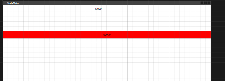 tn2>`ContentPresenter`是`ControlTemplate`的常用组件,负责显示控件的内容,可以动态呈现内容,并能够根据内容类型自适应的显示。 | 属性 | 描述 | | ------------ | ------------ | |Content| 要显示的内容,通常绑定到 ContentControl.Content。| |ContentTemplate| 一个 DataTemplate,定义如何显示内容。如果未设置,则按默认方式显示内容。| |ContentTemplateSelector| 一个选择器,用于动态选择 ContentTemplate。| |ContentStringFormat| 如果内容是字符串,可以通过格式化设置字符串的显示格式。| |RecognizesAccessKey| 是否识别快捷键(如 _File 显示为 File,并为快捷键 Alt+F 添加支持)。| |HorizontalAlignment| 控制内容的水平对齐方式(继承自 FrameworkElement)。| |VerticalAlignment| 控制内容的垂直对齐方式(继承自 FrameworkElement)。| TemplateBinding绑定 ------------ tn2>在 WPF 中,TemplateBinding 是一种简化的绑定方式,它专门用于控件模板内部属性与控件外部属性之间的绑定。它能够将控件外部设置的属性值传递到模板内部的控件元素,以便动态地更新控件的外观。 示例代码如下: ```xml <Window x:Class="WpfAppLearning.Window1" xmlns="http://schemas.microsoft.com/winfx/2006/xaml/presentation" xmlns:x="http://schemas.microsoft.com/winfx/2006/xaml" xmlns:d="http://schemas.microsoft.com/expression/blend/2008" xmlns:mc="http://schemas.openxmlformats.org/markup-compatibility/2006" xmlns:local="clr-namespace:WpfAppLearning" mc:Ignorable="d" Title="Window1" Height="450" Width="800"> <Window.Resources> <Style x:Key="ButtonStyle1" TargetType="{x:Type Button}"> <Setter Property="Template"> <Setter.Value> <ControlTemplate TargetType="{x:Type Button}"> <Border x:Name="border" CornerRadius="5" BorderThickness="2" BorderBrush="Red" Background="{TemplateBinding Background}"> <Grid Name="root"> <Grid.RowDefinitions> <RowDefinition/> <RowDefinition/> </Grid.RowDefinitions> <ContentPresenter Name="txt"/> <TextBlock Text="{TemplateBinding Tag}" Grid.Row="1" /> </Grid> </Border> <ControlTemplate.Triggers> <Trigger Property="IsMouseOver" Value="true"> <Setter Property="Background" Value="Red" TargetName="root"/> <Setter TargetName="border" Property="Background" Value="Orange"/> </Trigger> <Trigger Property="Tag" Value="0"> <Setter Property="Visibility" Value="Collapsed" TargetName="txt"/> </Trigger> </ControlTemplate.Triggers> </ControlTemplate> </Setter.Value> </Setter> </Style> </Window.Resources> <Grid> <StackPanel> <Button Style="{DynamicResource ButtonStyle1}" Content="Hmy" Width="120" Height="80" Tag="0" Background="Blue"></Button> </StackPanel> </Grid> </Window> ``` 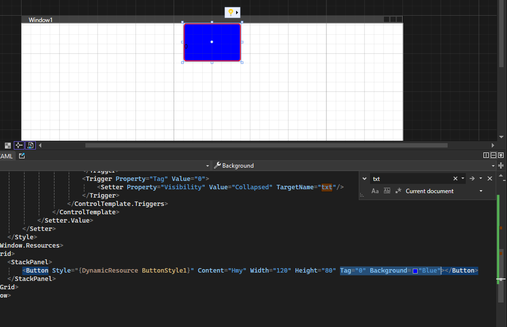 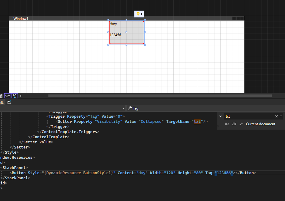 数据模板 ------------ tn2>在 WPF 中,ItemControl(如 ListBox、ComboBox、ListView 等)可以使用数据模板(DataTemplate)来定义如何展示其项(Items)的内容。当你绑定一个集合到 ItemControl 时,数据模板决定了每个集合项如何在 UI 中显示。 简单举例: ```xml <Window x:Class="WpfAppLearning.Window2" xmlns="http://schemas.microsoft.com/winfx/2006/xaml/presentation" xmlns:x="http://schemas.microsoft.com/winfx/2006/xaml" xmlns:d="http://schemas.microsoft.com/expression/blend/2008" xmlns:mc="http://schemas.openxmlformats.org/markup-compatibility/2006" xmlns:local="clr-namespace:WpfAppLearning" mc:Ignorable="d" Title="Window2" Height="450" Width="800"> <Window.Resources> <!-- 定义数据模板 --> <DataTemplate x:Key="PersonTemplate"> <StackPanel Orientation="Horizontal"> <TextBlock Text="Name: " FontWeight="Bold" /> <TextBlock Text="{Binding Name}" /> <TextBlock Text=" | Age: " FontWeight="Bold" /> <TextBlock Text="{Binding Age}" /> </StackPanel> </DataTemplate> </Window.Resources> <Grid> <!-- ListBox控件,用x:Array定义数据 --> <ListBox Name="personListBox" HorizontalAlignment="Left" VerticalAlignment="Top" Width="300" Height="200" ItemTemplate="{StaticResource PersonTemplate}"> <ListBox.ItemsSource> <x:Array Type="{x:Type local:Person}"> <local:Person Name="Alice" Age="30" /> <local:Person Name="Bob" Age="25" /> <local:Person Name="Charlie" Age="35" /> </x:Array> </ListBox.ItemsSource> </ListBox> </Grid> </Window> ``` tn2>`Person`类。 ```csharp public class Person { public int Age { get; set; } public string Name { get; set; } } ``` 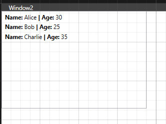 ### ItemContainerStyle tn2>定义了 `ListViewItem`(即每个项的容器)的样式。 我们设置了 `Background`、`Margin`、`Padding` 等属性,并且使用 `Trigger` 在鼠标悬停时改变背景色。 ```xml <Window x:Class="WpfAppLearning.Window4" xmlns="http://schemas.microsoft.com/winfx/2006/xaml/presentation" xmlns:x="http://schemas.microsoft.com/winfx/2006/xaml" xmlns:d="http://schemas.microsoft.com/expression/blend/2008" xmlns:mc="http://schemas.openxmlformats.org/markup-compatibility/2006" xmlns:local="clr-namespace:WpfAppLearning" mc:Ignorable="d" Title="Window4" Height="450" Width="800"> <Window.Resources> <!-- 1. 定义 ItemTemplate:控制数据项的展示 --> <DataTemplate x:Key="PersonTemplate"> <StackPanel Orientation="Horizontal"> <TextBlock Text="Name: " FontWeight="Bold" /> <TextBlock Text="{Binding Name}" /> <TextBlock Text=" | Age: " FontWeight="Bold" /> <TextBlock Text="{Binding Age}" /> </StackPanel> </DataTemplate> <!-- 2. 定义 ItemContainerStyle:控制 ListViewItem 的样式 --> <Style x:Key="ItemContainerStyle" TargetType="ListViewItem"> <Setter Property="Background" Value="LightGray" /> <Setter Property="Margin" Value="5" /> <Setter Property="Padding" Value="10" /> <Setter Property="BorderBrush" Value="Blue" /> <Setter Property="BorderThickness" Value="1" /> <Setter Property="HorizontalAlignment" Value="Stretch" /> <Style.Triggers> <!-- 鼠标悬停时更改背景色 --> <Trigger Property="IsMouseOver" Value="True"> <Setter Property="Background" Value="Orange" /> </Trigger> </Style.Triggers> </Style> </Window.Resources> <Grid> <!-- 5. ListView控件 --> <ListView ItemTemplate="{StaticResource PersonTemplate}" ItemContainerStyle="{StaticResource ItemContainerStyle}" > <ListBox.ItemsSource> <x:Array Type="{x:Type local:Person}"> <local:Person Name="Alice" Age="30" /> <local:Person Name="Bob" Age="25" /> <local:Person Name="Charlie" Age="35" /> <local:Person Name="Charlie" Age="35" /> <local:Person Name="Charlie" Age="35" /> <local:Person Name="Charlie" Age="35" /> <local:Person Name="Charlie" Age="35" /> <local:Person Name="Charlie" Age="35" /> </x:Array> </ListBox.ItemsSource> </ListView> </Grid> </Window> ``` 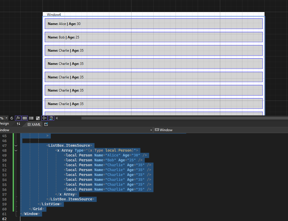 ### ItemsPanel 控制项布局 tn2>控制 `ListView` 中项的布局。 在这个例子中,我们使用了 `WrapPanel` 来让项按行排列,自动换行。 这意味着,如果项的宽度超过容器的宽度,它会自动换到下一行。 ```xml <Window x:Class="WpfAppLearning.Window4" xmlns="http://schemas.microsoft.com/winfx/2006/xaml/presentation" xmlns:x="http://schemas.microsoft.com/winfx/2006/xaml" xmlns:d="http://schemas.microsoft.com/expression/blend/2008" xmlns:mc="http://schemas.openxmlformats.org/markup-compatibility/2006" xmlns:local="clr-namespace:WpfAppLearning" mc:Ignorable="d" Title="Window4" Height="450" Width="800"> <Window.Resources> <!-- 1. 定义 ItemTemplate:控制数据项的展示 --> <DataTemplate x:Key="PersonTemplate"> <StackPanel Orientation="Horizontal"> <TextBlock Text="Name: " FontWeight="Bold" /> <TextBlock Text="{Binding Name}" /> <TextBlock Text=" | Age: " FontWeight="Bold" /> <TextBlock Text="{Binding Age}" /> </StackPanel> </DataTemplate> <!-- 2. 定义 ItemContainerStyle:控制 ListViewItem 的样式 --> <Style x:Key="ItemContainerStyle" TargetType="ListViewItem"> <Setter Property="Background" Value="LightGray" /> <Setter Property="Margin" Value="5" /> <Setter Property="Padding" Value="10" /> <Setter Property="BorderBrush" Value="Blue" /> <Setter Property="BorderThickness" Value="1" /> <Setter Property="HorizontalAlignment" Value="Stretch" /> <Style.Triggers> <!-- 鼠标悬停时更改背景色 --> <Trigger Property="IsMouseOver" Value="True"> <Setter Property="Background" Value="Orange" /> </Trigger> </Style.Triggers> </Style> <!-- 4. 定义 ItemsPanel:控制项的布局 --> <ItemsPanelTemplate x:Key="ItemsPanelTemplate"> <WrapPanel /> </ItemsPanelTemplate> </Window.Resources> <Grid> <!-- 5. ListView控件 --> <ListView ItemTemplate="{StaticResource PersonTemplate}" ItemContainerStyle="{StaticResource ItemContainerStyle}" ItemsPanel="{StaticResource ItemsPanelTemplate}" > <ListBox.ItemsSource> <x:Array Type="{x:Type local:Person}"> <local:Person Name="Alice" Age="30" /> <local:Person Name="Bob" Age="25" /> <local:Person Name="Charlie" Age="35" /> <local:Person Name="Charlie" Age="35" /> <local:Person Name="Charlie" Age="35" /> <local:Person Name="Charlie" Age="35" /> <local:Person Name="Charlie" Age="35" /> <local:Person Name="Charlie" Age="35" /> </x:Array> </ListBox.ItemsSource> </ListView> </Grid> </Window> ``` 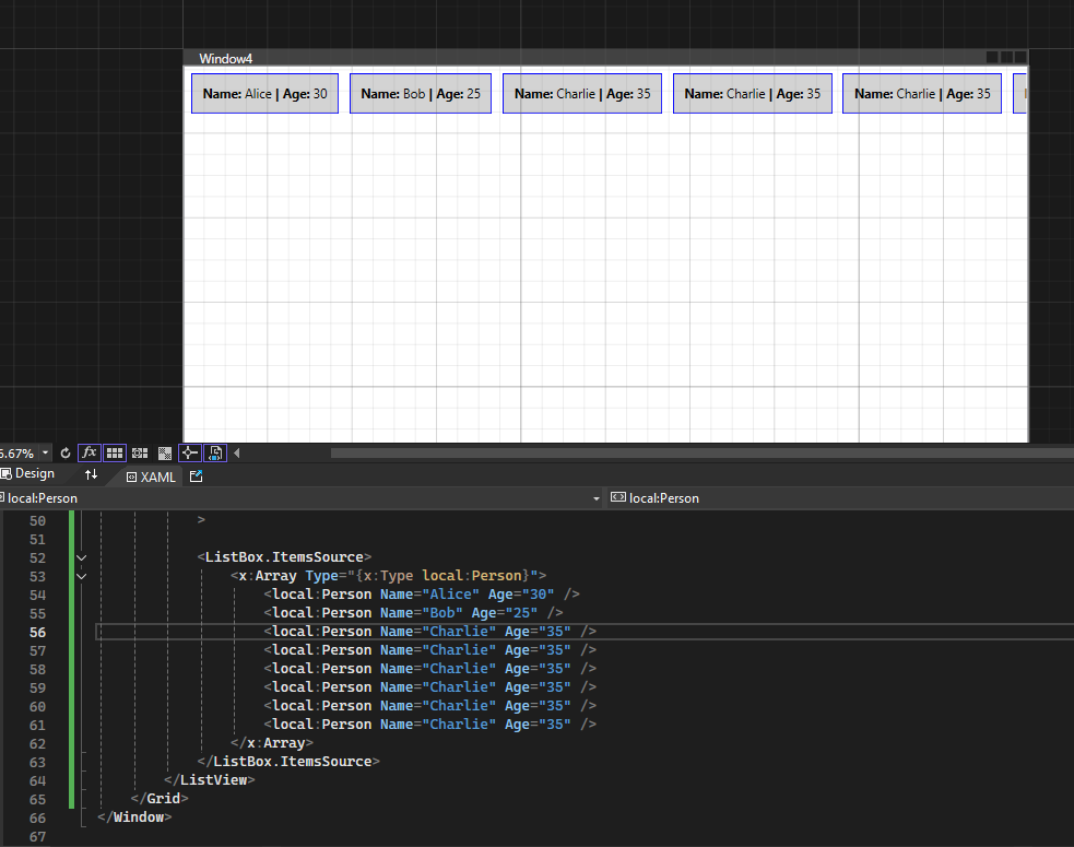 ### ItemsControl的ControlTemplate `ItemsControl` 主要是用于显示一组数据项(比如 `ListBox`、`ListView`、`ComboBox` 等控件)。通常,它的外观(如边框、背景、滚动条等)是由 `ControlTemplate` 控制的。在 `ItemsControl` 中,`ItemTemplate` 用于控制单个项的显示,而 `ControlTemplate` 则控制整个控件的布局和外观。 举个例子: ```xml <Window x:Class="WpfAppLearning.Window5" xmlns="http://schemas.microsoft.com/winfx/2006/xaml/presentation" xmlns:x="http://schemas.microsoft.com/winfx/2006/xaml" xmlns:d="http://schemas.microsoft.com/expression/blend/2008" xmlns:mc="http://schemas.openxmlformats.org/markup-compatibility/2006" xmlns:local="clr-namespace:WpfAppLearning" xmlns:sys="clr-namespace:System;assembly=mscorlib" mc:Ignorable="d" Title="Window5" Height="450" Width="800"> <Window.Resources> <!-- 定义 ItemTemplate:控制每个项的展示 --> <DataTemplate x:Key="ItemTemplate"> <TextBlock Text="{Binding}" FontSize="16" VerticalAlignment="Center" HorizontalAlignment="Center" /> </DataTemplate> <!-- 定义 ItemsControl 的 ControlTemplate --> <ControlTemplate x:Key="ItemsControlTemplate" TargetType="ItemsControl"> <Border Background="LightBlue" BorderBrush="DarkBlue" BorderThickness="2" CornerRadius="10"> <ScrollViewer> <StackPanel> <!-- 在这里使用了 ContentPresenter 来显示每一项 --> <ItemsPresenter /> </StackPanel> </ScrollViewer> </Border> </ControlTemplate> </Window.Resources> <Grid> <ItemsControl ItemTemplate="{StaticResource ItemTemplate}" Template="{StaticResource ItemsControlTemplate}" > <ItemsControl.ItemsSource> <x:Array Type="{x:Type sys:String}"> <sys:String>Alice</sys:String> <sys:String>Bob</sys:String> <sys:String>Charlie</sys:String> <sys:String>Charlie</sys:String> <sys:String>Charlie</sys:String> <sys:String>Charlie</sys:String> <sys:String>Charlie</sys:String> <sys:String>Charlie</sys:String> </x:Array> </ItemsControl.ItemsSource> </ItemsControl> </Grid> </Window> ``` 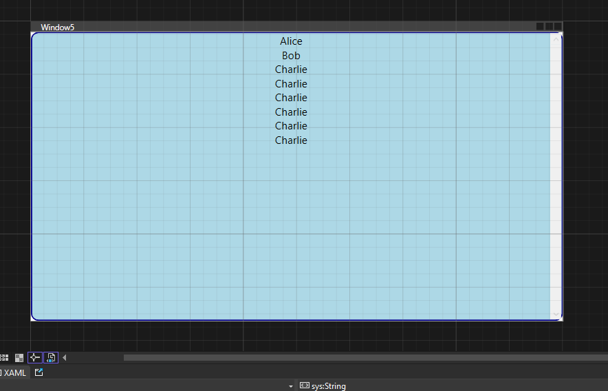 ### ItemTemplateSelector不同Item做不同的模板选择 tn2>可以自定义一些条件让Item选择不同的模板,这里我们判断小于20岁的使用的模板的背景颜色标注红色,大于20岁的不变。 创建一个`ListViewItemTemplateSelector`类。 ```csharp public class ListViewItemTemplateSelector:DataTemplateSelector { public DataTemplate DaYU_Age_22_Template { get; set; } public DataTemplate XiaoYU_Age_22_Template { get; set; } /// <summary> /// /// </summary> /// <param name="item">每个控件子项所对应的数据子项</param> /// <param name="container"></param> /// <returns></returns> public override DataTemplate SelectTemplate(object item, DependencyObject container) { var nowperson = item as Person; if (nowperson.Age > 22) { return DaYU_Age_22_Template; } return XiaoYU_Age_22_Template; } } ``` tn2>这里定义了两个数据模板`PersonTemplate1`和`PersonTemplate2`,当数据中年龄小于22岁时使用`PersonTemplate2`加载该item,当年龄大于22岁时使用`PersonTemplate1`模板。 ```csharp <Window x:Class="WpfAppLearning.Window4" xmlns="http://schemas.microsoft.com/winfx/2006/xaml/presentation" xmlns:x="http://schemas.microsoft.com/winfx/2006/xaml" xmlns:d="http://schemas.microsoft.com/expression/blend/2008" xmlns:mc="http://schemas.openxmlformats.org/markup-compatibility/2006" xmlns:local="clr-namespace:WpfAppLearning" mc:Ignorable="d" Title="Window4" Height="450" Width="800"> <Window.Resources> <!-- 1. 定义 ItemTemplate:控制数据项的展示 --> <DataTemplate x:Key="PersonTemplate1"> <StackPanel Orientation="Horizontal"> <TextBlock Text="Name: " FontWeight="Bold" /> <TextBlock Text="{Binding Name}" /> <TextBlock Text=" | Age: " FontWeight="Bold" /> <TextBlock Text="{Binding Age}" /> </StackPanel> </DataTemplate> <DataTemplate x:Key="PersonTemplate2"> <StackPanel Orientation="Horizontal" Background="Red"> <TextBlock Text="Name: " FontWeight="Bold" /> <TextBlock Text="{Binding Name}" /> <TextBlock Text=" | Age: " FontWeight="Bold" /> <TextBlock Text="{Binding Age}" /> </StackPanel> </DataTemplate> <!-- 2. 定义 ItemContainerStyle:控制 ListViewItem 的样式 --> <Style x:Key="ItemContainerStyle" TargetType="ListViewItem"> <Setter Property="Background" Value="LightGray" /> <Setter Property="Margin" Value="5" /> <Setter Property="Padding" Value="10" /> <Setter Property="BorderBrush" Value="Blue" /> <Setter Property="BorderThickness" Value="1" /> <Setter Property="HorizontalAlignment" Value="Stretch" /> <Style.Triggers> <!-- 鼠标悬停时更改背景色 --> <Trigger Property="IsMouseOver" Value="True"> <Setter Property="Background" Value="Orange" /> </Trigger> </Style.Triggers> </Style> </Window.Resources> <Grid> <!-- 5. ListView控件 --> <ListView ItemContainerStyle="{StaticResource ItemContainerStyle}" > <ListView.ItemTemplateSelector> <local:ListViewItemTemplateSelector DaYU_Age_22_Template="{StaticResource PersonTemplate1}" XiaoYU_Age_22_Template="{StaticResource PersonTemplate2}"/> </ListView.ItemTemplateSelector> <ListBox.ItemsSource> <x:Array Type="{x:Type local:Person}"> <local:Person Name="Alice" Age="30" /> <local:Person Name="Bob" Age="25" /> <local:Person Name="Charlie" Age="18" /> <local:Person Name="Charlie" Age="20" /> <local:Person Name="Charlie" Age="9" /> <local:Person Name="Charlie" Age="6" /> <local:Person Name="Charlie" Age="59" /> <local:Person Name="Charlie" Age="35" /> </x:Array> </ListBox.ItemsSource> </ListView> </Grid> </Window> ``` 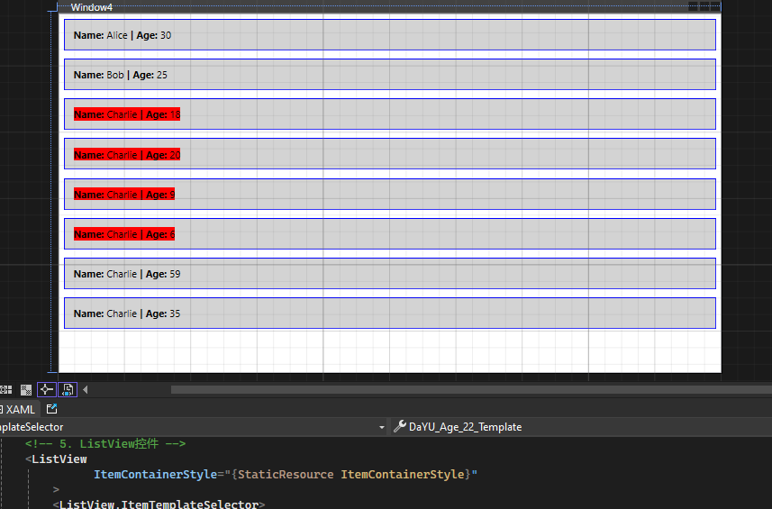 ### ItemContainerStyleSelector tn2>与`ItemTemplateSelector`类似,只是它是通过样式来决定,这里我就直接提供代码了(通过设置Border的颜色来决定): ```csharp <Window x:Class="WpfAppLearning.Window4" xmlns="http://schemas.microsoft.com/winfx/2006/xaml/presentation" xmlns:x="http://schemas.microsoft.com/winfx/2006/xaml" xmlns:d="http://schemas.microsoft.com/expression/blend/2008" xmlns:mc="http://schemas.openxmlformats.org/markup-compatibility/2006" xmlns:local="clr-namespace:WpfAppLearning" mc:Ignorable="d" Title="Window4" Height="450" Width="800"> <Window.Resources> <!-- 1. 定义 ItemTemplate:控制数据项的展示 --> <DataTemplate x:Key="PersonTemplate1"> <StackPanel Orientation="Horizontal"> <TextBlock Text="Name: " FontWeight="Bold" /> <TextBlock Text="{Binding Name}" /> <TextBlock Text=" | Age: " FontWeight="Bold" /> <TextBlock Text="{Binding Age}" /> </StackPanel> </DataTemplate> <DataTemplate x:Key="PersonTemplate2"> <StackPanel Orientation="Horizontal" Background="Red"> <TextBlock Text="Name: " FontWeight="Bold" /> <TextBlock Text="{Binding Name}" /> <TextBlock Text=" | Age: " FontWeight="Bold" /> <TextBlock Text="{Binding Age}" /> </StackPanel> </DataTemplate> <!-- 2. 定义 ItemContainerStyle:控制 ListViewItem 的样式 --> <Style x:Key="ItemContainerStyle1" TargetType="ListViewItem"> <Setter Property="BorderBrush" Value="Blue" /> </Style> <Style x:Key="ItemContainerStyle2" TargetType="ListViewItem"> <Setter Property="BorderBrush" Value="Red" /> </Style> </Window.Resources> <Grid> <!-- 5. ListView控件 --> <ListView > <ListView.ItemTemplateSelector> <local:ListViewItemTemplateSelector DaYU_Age_22_Template="{StaticResource PersonTemplate1}" XiaoYU_Age_22_Template="{StaticResource PersonTemplate2}"/> </ListView.ItemTemplateSelector> <ListView.ItemContainerStyleSelector> <local:TestContainerStyleSelector DaYU_Age_22_Template="{StaticResource ItemContainerStyle1}" XiaoYU_Age_22_Template="{StaticResource ItemContainerStyle2}" /> </ListView.ItemContainerStyleSelector> <ListBox.ItemsSource> <x:Array Type="{x:Type local:Person}"> <local:Person Name="Alice" Age="30" /> <local:Person Name="Bob" Age="25" /> <local:Person Name="Charlie" Age="18" /> <local:Person Name="Charlie" Age="20" /> <local:Person Name="Charlie" Age="9" /> <local:Person Name="Charlie" Age="6" /> <local:Person Name="Charlie" Age="59" /> <local:Person Name="Charlie" Age="35" /> </x:Array> </ListBox.ItemsSource> </ListView> </Grid> </Window> ``` ```csharp public class TestContainerStyleSelector: StyleSelector { public Style DaYU_Age_22_Template { get; set; } public Style XiaoYU_Age_22_Template { get; set; } public override Style SelectStyle(object item, DependencyObject container) { var nowperson = item as Person; if (nowperson.Age > 22) { return DaYU_Age_22_Template; } return XiaoYU_Age_22_Template; } } ``` 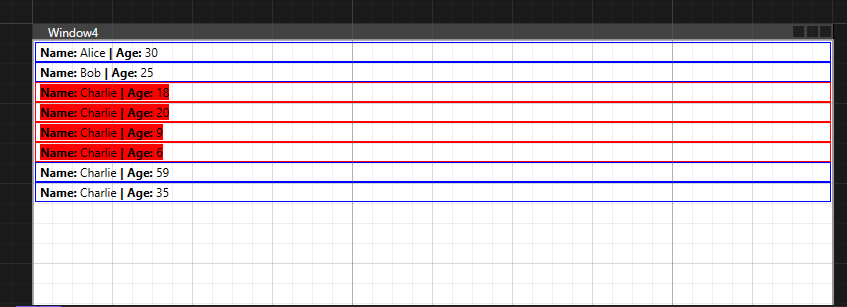 ### AlternationCount 数据组 tn2>AlternationCount这里可以在集合中设置以几行为一组,然后我通过Trigger设置,每组下标为1的背景颜色为橘色。 核心代码: ```xml <Trigger Property="ItemsControl.AlternationIndex" Value="1"> <Setter Property="Background" Value="Orange" /> </Trigger> ... <ListView ItemTemplate="{StaticResource PersonTemplate}" ItemContainerStyle="{StaticResource ItemContainerStyle}" AlternationCount="2" > ``` tn2>完整代码如下: ```xml <Window x:Class="WpfAppLearning.Window3" xmlns="http://schemas.microsoft.com/winfx/2006/xaml/presentation" xmlns:x="http://schemas.microsoft.com/winfx/2006/xaml" xmlns:d="http://schemas.microsoft.com/expression/blend/2008" xmlns:mc="http://schemas.openxmlformats.org/markup-compatibility/2006" xmlns:local="clr-namespace:WpfAppLearning" mc:Ignorable="d" Title="Window3" Height="450" Width="800"> <Window.Resources> <!-- 1. 定义 ItemTemplate:控制数据项的展示 --> <DataTemplate x:Key="PersonTemplate"> <StackPanel Orientation="Horizontal"> <TextBlock Text="Name: " FontWeight="Bold" /> <TextBlock Text="{Binding Name}" /> <TextBlock Text=" | Age: " FontWeight="Bold" /> <TextBlock Text="{Binding Age}" /> </StackPanel> </DataTemplate> <!-- 2. 定义 ItemContainerStyle:控制 ListViewItem 的样式 --> <Style x:Key="ItemContainerStyle" TargetType="ListViewItem"> <Setter Property="Background" Value="LightGray" /> <Setter Property="Margin" Value="5" /> <Setter Property="Padding" Value="10" /> <Setter Property="BorderBrush" Value="Black" /> <Setter Property="BorderThickness" Value="1" /> <Setter Property="HorizontalAlignment" Value="Stretch" /> <Style.Triggers> <!-- 鼠标悬停时更改背景色 --> <Trigger Property="ItemsControl.AlternationIndex" Value="1"> <Setter Property="Background" Value="Orange" /> </Trigger> </Style.Triggers> </Style> </Window.Resources> <Grid> <!-- 5. ListView控件 --> <ListView ItemTemplate="{StaticResource PersonTemplate}" ItemContainerStyle="{StaticResource ItemContainerStyle}" AlternationCount="2" > <ListBox.ItemsSource> <x:Array Type="{x:Type local:Person}"> <local:Person Name="Alice" Age="30" /> <local:Person Name="Bob" Age="25" /> <local:Person Name="Charlie" Age="35" /> <local:Person Name="Charlie" Age="35" /> <local:Person Name="Charlie" Age="35" /> <local:Person Name="Charlie" Age="35" /> <local:Person Name="Charlie" Age="35" /> <local:Person Name="Charlie" Age="35" /> <local:Person Name="Charlie" Age="35" /> <local:Person Name="Charlie" Age="35" /> <local:Person Name="Charlie" Age="35" /> <local:Person Name="Charlie" Age="35" /> <local:Person Name="Charlie" Age="35" /> <local:Person Name="Charlie" Age="35" /> <local:Person Name="Charlie" Age="35" /> <local:Person Name="Charlie" Age="35" /> <local:Person Name="Charlie" Age="35" /> <local:Person Name="Charlie" Age="35" /> <local:Person Name="Charlie" Age="35" /> <local:Person Name="Charlie" Age="35" /> <local:Person Name="Charlie" Age="35" /> <local:Person Name="Charlie" Age="35" /> <local:Person Name="Charlie" Age="35" /> <local:Person Name="Charlie" Age="35" /> <local:Person Name="Charlie" Age="35" /> <local:Person Name="Charlie" Age="35" /> <local:Person Name="Charlie" Age="35" /> <local:Person Name="Charlie" Age="35" /> <local:Person Name="Charlie" Age="35" /> <local:Person Name="Charlie" Age="35" /> <local:Person Name="Charlie" Age="35" /> <local:Person Name="Charlie" Age="35" /> <local:Person Name="Charlie" Age="35" /> <local:Person Name="Charlie" Age="35" /> <local:Person Name="Charlie" Age="35" /> <local:Person Name="Charlie" Age="35" /> <local:Person Name="Charlie" Age="35" /> <local:Person Name="Charlie" Age="35" /> <local:Person Name="Charlie" Age="35" /> <local:Person Name="Charlie" Age="35" /> <local:Person Name="Charlie" Age="35" /> <local:Person Name="Charlie" Age="35" /> <local:Person Name="Charlie" Age="35" /> <local:Person Name="Charlie" Age="35" /> <local:Person Name="Charlie" Age="35" /> <local:Person Name="Charlie" Age="35" /> <local:Person Name="Charlie" Age="35" /> <local:Person Name="Charlie" Age="35" /> <local:Person Name="Charlie" Age="35" /> <local:Person Name="Charlie" Age="35" /> <local:Person Name="Charlie" Age="35" /> <local:Person Name="Charlie" Age="35" /> <local:Person Name="Charlie" Age="35" /> <local:Person Name="Charlie" Age="35" /> <local:Person Name="Charlie" Age="35" /> </x:Array> </ListBox.ItemsSource> </ListView> </Grid> </Window> ``` 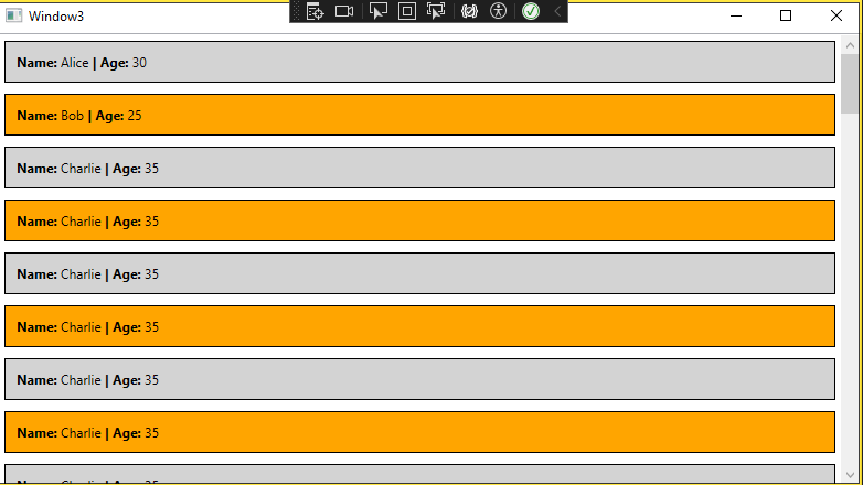 简单的Checkbox样式示例 ------------ ```xml <Window x:Class="WpfAppLearning.Window6" xmlns="http://schemas.microsoft.com/winfx/2006/xaml/presentation" xmlns:x="http://schemas.microsoft.com/winfx/2006/xaml" xmlns:d="http://schemas.microsoft.com/expression/blend/2008" xmlns:mc="http://schemas.openxmlformats.org/markup-compatibility/2006" xmlns:local="clr-namespace:WpfAppLearning" mc:Ignorable="d" Title="Window6" Height="450" Width="800"> <Window.Resources> <Style x:Key="chkBullet" TargetType="CheckBox"> <Setter Property="IsChecked" Value="False"/> <Setter Property="Background" Value="Transparent"/> <Setter Property="Foreground" Value="#999"/> <Setter Property="Template"> <Setter.Value> <ControlTemplate TargetType="CheckBox"> <Border Width="60" Height="20" CornerRadius="10" Background="{TemplateBinding Background}" > <Grid> <Border x:Name="border" Width="18" Height="18" CornerRadius="9" VerticalAlignment="Center" HorizontalAlignment="Left" Margin="1 0" Background="White"> <Border.RenderTransform> <TranslateTransform X="0"/> </Border.RenderTransform> </Border> <TextBlock x:Name="txt" Text="{TemplateBinding Content}" Margin="9 0" VerticalAlignment="Center" Foreground="White" > <TextBlock.RenderTransform> <TranslateTransform X="18"></TranslateTransform> </TextBlock.RenderTransform> </TextBlock> </Grid> </Border> <ControlTemplate.Triggers> <Trigger Property="IsChecked" Value="true"> <Setter Property="Text" TargetName="txt" Value="{Binding Tag,RelativeSource={RelativeSource TemplatedParent}}"/> <Trigger.EnterActions> <BeginStoryboard> <Storyboard> <DoubleAnimation Storyboard.TargetName="border" Storyboard.TargetProperty="(UIElement.RenderTransform).(TranslateTransform.X)" To="40" Duration="00:00:0.2"/> <DoubleAnimation Storyboard.TargetName="txt" Storyboard.TargetProperty="(UIElement.RenderTransform).(TranslateTransform.X)" To="0" Duration="00:00:0.2"/> </Storyboard> </BeginStoryboard> </Trigger.EnterActions> <Trigger.ExitActions> <BeginStoryboard> <Storyboard> <DoubleAnimation Storyboard.TargetName="border" Storyboard.TargetProperty="(UIElement.RenderTransform).(TranslateTransform.X)" To="0" Duration="00:00:0.2"/> <DoubleAnimation Storyboard.TargetName="txt" Storyboard.TargetProperty="(UIElement.RenderTransform).(TranslateTransform.X)" To="18" Duration="00:00:0.2"/> </Storyboard> </BeginStoryboard> </Trigger.ExitActions> </Trigger> <Trigger Property="IsChecked" Value="False"> <Setter Property="Text" TargetName="txt" Value="{Binding Content,RelativeSource={RelativeSource TemplatedParent}}"/> </Trigger> </ControlTemplate.Triggers> </ControlTemplate> </Setter.Value> </Setter> </Style> </Window.Resources> <Grid> <CheckBox Style="{StaticResource chkBullet}" Background="#5387b9" IsChecked="False" Content="Off" Tag="On" Margin="10"/> </Grid> </Window> ``` 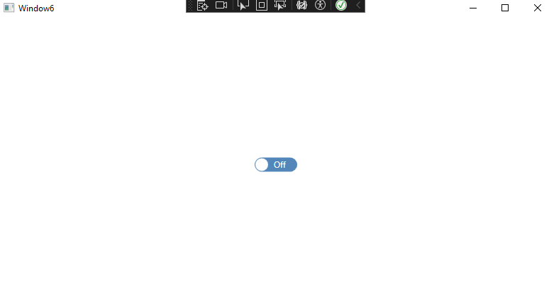

