Xamarin.Forms Label 电脑版发表于:2022/4/23 18:00  >#Xamarin.Forms Label [TOC] ## 简介与属性列表 tn2>标签用于显示单行文本元素以及文本的多行块。 (下面是相关常用属性列表) | 字段与属性 | 描述 | | ------------ | ------------ | | Text | 获取或设置 Label 的文本。 | | FontSize | 获取标签的字体大小。 | | TextColor | 获取或设置 Label 的文本的 Color。 | | LineHeight | 获取或设置显示文本时要应用于默认行高的乘数。 | | HorizontalOptions | 获取或设置 LayoutOptions,它定义元素在布局周期中的布局方式。 | | LineBreakMode | 获取或设置 Label 的 换行模式。 | | FontAttributes | 获取一个值,该值指示标签的字体是粗体、斜体还是两者皆否。 | | TextDecorations | 获取或设置应用于 Text 的文字装饰。 | | Style | 包含触发器、资源库和行为的类,这些所含内容将完全或部分定义可视元素类的外观和行为。 | | Command | 命令 | | CommandParameter | 命令所需要的参数。 | | FormattedString | 表示某些部分应用了一些特性的文本。 | ## 案例 tn2>创建一个Xamarin应用后,添加一个Labels页面,并在Labels.xaml中添加如下内容: ```xml <?xml version="1.0" encoding="UTF-8" ?> <ContentPage xmlns="http://xamarin.com/schemas/2014/forms" xmlns:x="http://schemas.microsoft.com/winfx/2009/xaml" x:Class="LableApp.Labels"> <ContentPage.Content> <StackLayout> <Label Text="Label:1 Welcom to Xamarin.Forms!"/> <Label Text="Label:2 Welcom to Xamarin.Forms!" FontSize="Large"/> <Label Text="Label:3 Welcom to Xamarin.Forms!" FontSize="Large" TextColor="DarkBlue"/> <Label Text="Label:4 Welcom to Xamarin.Forms!" FontSize="Large" LineHeight="15"/> <Label Text="Label:5 Welcom to Xamarin.Forms!" HorizontalOptions="Center"/> <Label Text="Label:6 Welcom to Xamarin.Forms!Welcom to Xamarin.Forms!Welcom to Xamarin.Forms!Welcom to Xamarin.Forms!Welcom to Xamarin.Forms!" HorizontalOptions="Center" LineBreakMode="WordWrap" /> <Label Text="Label:7 Welcom to Xamarin.Forms!Welcom to Xamarin.Forms!Welcom to Xamarin.Forms!Welcom to Xamarin.Forms!Welcom to Xamarin.Forms!" HorizontalOptions="Center" LineBreakMode="NoWrap" /> <Label Text="Label:8 Welcom to Xamarin.Forms!" TextColor="Blue" FontAttributes="Italic" FontSize="24" TextDecorations="Underline" HorizontalOptions="Center" /> <Label LineBreakMode="WordWrap"> <Label.FormattedText> <FormattedString> <Span Text="Label-9 Red Bold" TextColor="Red" FontAttributes="Bold"/> <Span Text="Label-10 default" Style="{DynamicResource BoldStyle}"/> <Span Text="Label-11 default" FontAttributes="Italic" FontSize="Small"/> </FormattedString> </Label.FormattedText> </Label> <Label TextColor="Gray" FontSize="Medium" LineBreakMode="WordWrap"> <Label.FormattedText> <FormattedString> <Span Text="Label-11: TNBLOG Channel"/> <Span FontAttributes="Italic"/> <Span Text="Click Here" TextDecorations="Underline" TextColor="Blue"> <Span.GestureRecognizers> <TapGestureRecognizer Command="{Binding TapCommand}" CommandParameter="https://www.tnblog.net/"/> </Span.GestureRecognizers> </Span> </FormattedString> </Label.FormattedText> </Label> </StackLayout> </ContentPage.Content> </ContentPage> ``` tn2>并且在后台呢,我们添加TapCommand命令方法。 ```csharp public partial class Labels : ContentPage { public ICommand TapCommand => new Command<string>(OpenBrowser); public Labels () { InitializeComponent (); BindingContext = this; } void OpenBrowser(string url) { Launcher.OpenAsync(url); } } ``` tn2>改改`App.xaml.cs`的入口方法。 ```csharp public App () { InitializeComponent(); //MainPage = new MainPage(); MainPage = new Labels(); } ``` ## 运行测试 tn2>首先我们通过安卓打开我们的APP,然后我们通过点击Tnblog链接跳转到Tnblog官网 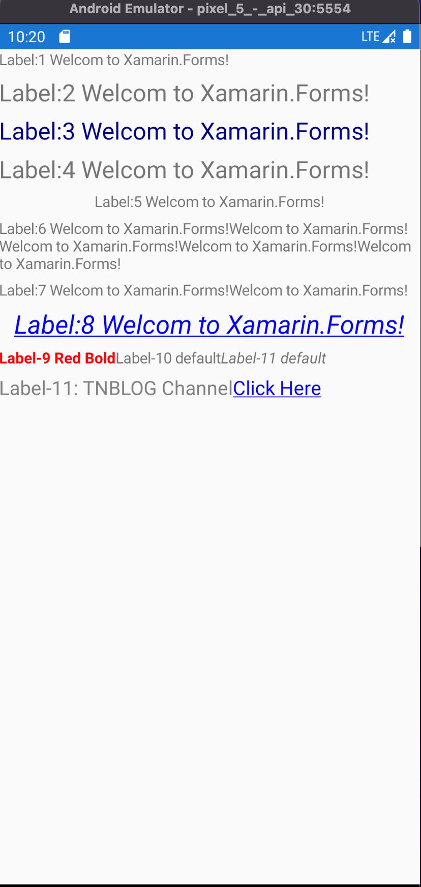  tn2>接下来展示IOS的运行结果 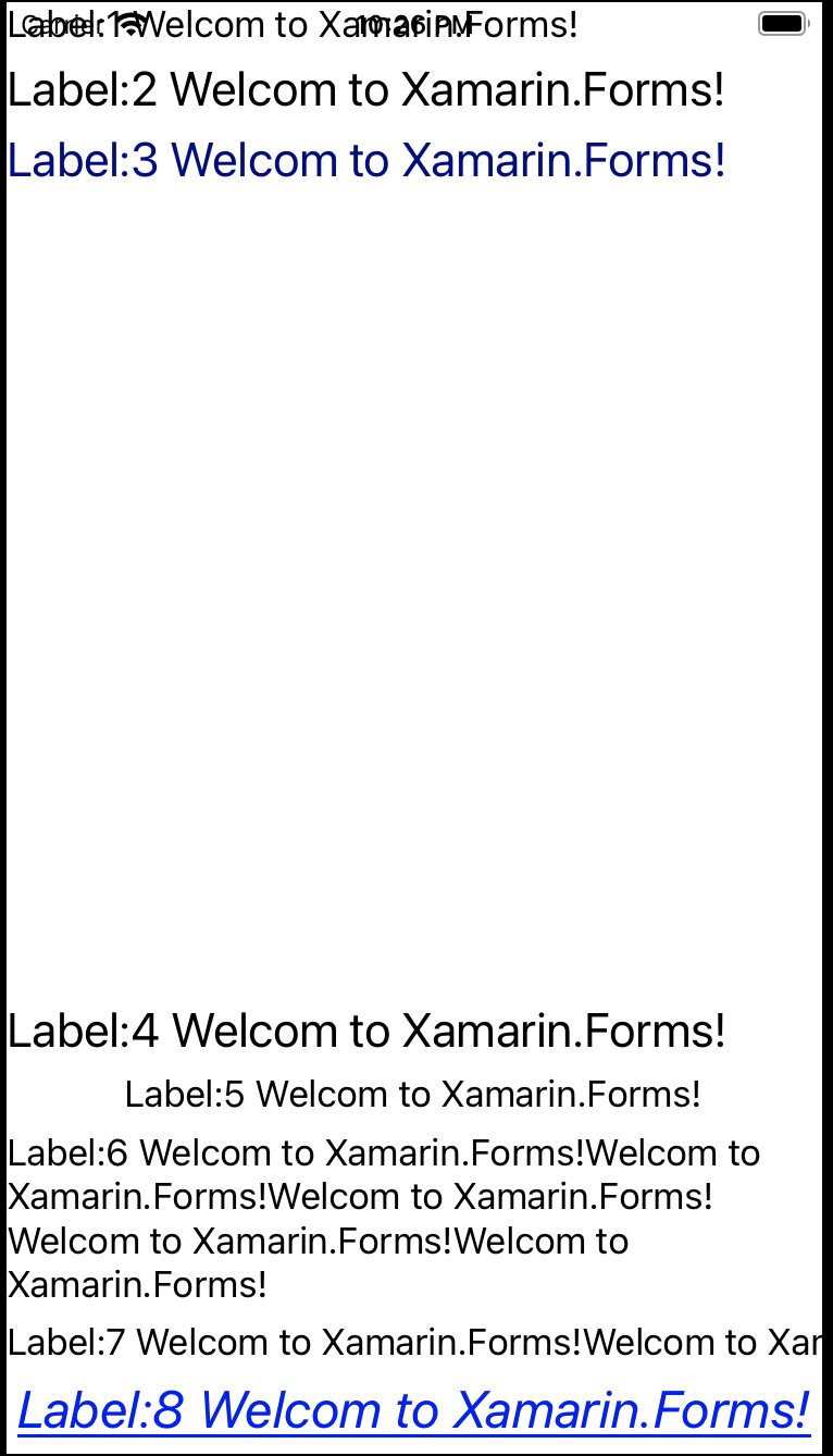 tn2>我们发现这个中间的间距很大,我认为是每行它都是有一定的高度的,所以我们在第四个label的时候把`LineHeight="15"`去掉就可以了 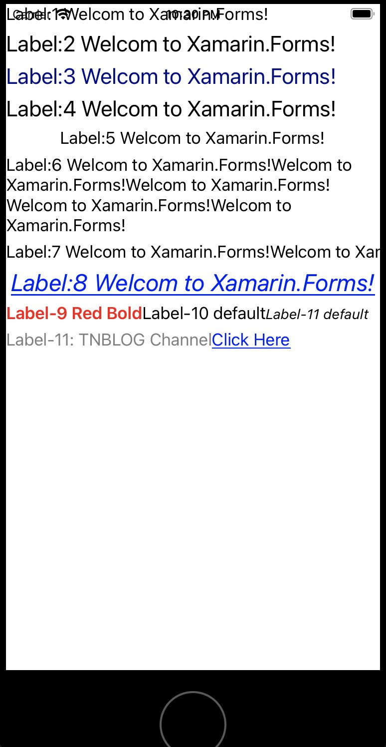  tn2>接下来我将对上面比较有意义的属性设置的代码进行讲解。 ## 静态资源与动态资源(StaticResource and DynamicResource) tn2>静态资源(StaticResource)指的是:在程序载入内存时对资源的一次性使用,之后就不再访问这个资源了,即使资源对象被改变也不会生效。 动态资源(DynamicResource)使用指的是:在程序运行过程中然会去访问资源,当资源对象被改变时,再次访问会访问到改变后的对象。 下面我们将改变一些代码来进行演示。 >### Demo tn2>首先我们通过`ContentPage.Resources`定义两个Label样式(Style)资源对象`Res1`和`Res2`,并且将它们最先开始都设置为绿色(Green)颜色。我们通过`x:Key`来定义资源的名称,通过`TargetType`来设置该资源指定用在哪个类型上,Setter来设置该类型要修改的属性(`Property`)与需要设置的属性值(`Value`),在Label下可以添加多个Setter来指定要修改该类型上的多个属性值。 ```xml <ContentPage.Resources> <Color x:Key="FirstLabelColor">Green</Color> <Style x:Key="Res1" TargetType="{x:Type Label}"> <Setter Property="BackgroundColor" Value="{StaticResource FirstLabelColor}" /> </Style> <Style x:Key="Res2" TargetType="{x:Type Label}"> <Setter Property="BackgroundColor" Value="{StaticResource FirstLabelColor}" /> </Style> </ContentPage.Resources> ``` tn2>为了演示效果更明显,我们将`Res1`样式静态资源定义到Label1上,将`Res2`样式动态资源定义到Label2上,并且我们为Label2绑定点击命令(`StyleCommand`)。当我们点击Label2时,设置所有自定义资源都将改变为红色。 ```xml <Label Text="Label:1 Welcom to Xamarin.Forms!" Style="{StaticResource Res1}" LineHeight="10"/> <Label Text="Label:2 Welcom to Xamarin.Forms!" Style="{DynamicResource Res2}" FontSize="Large"> <Label.GestureRecognizers> <TapGestureRecognizer Command="{Binding StyleCommand}"/> </Label.GestureRecognizers> </Label> ``` tn2>关于这个StyleCommand命令我们对应的是StyleChange方法,我们发现有定义Color,Style,Setters....这些是从哪儿来的呢?其实就是从xaml上抄过来的,我们定义资源的时候定义了Style、Setter、以及它们的类型属性Label、Property、Value什么的。关于`this.Resources`这里是我们所有的资源对象集合。 这个`BackgroundColorProperty`是从Label上来的,也就是`Label.BackgroundColorProperty`。 ```csharp public partial class Labels : ContentPage { public ICommand TapCommand => new Command<string>(OpenBrowser); public ICommand StyleCommand => new Command(StyleChange); void StyleChange() { Color color = Color.Red; var style = new Style(typeof(Label)); style.Setters.Add(new Setter() { Property = BackgroundColorProperty, Value = color }); this.Resources["Res1"] = style; this.Resources["Res2"] = style; } public Labels () { InitializeComponent (); BindingContext = this; } void OpenBrowser(string url) { Launcher.OpenAsync(url); } } ``` 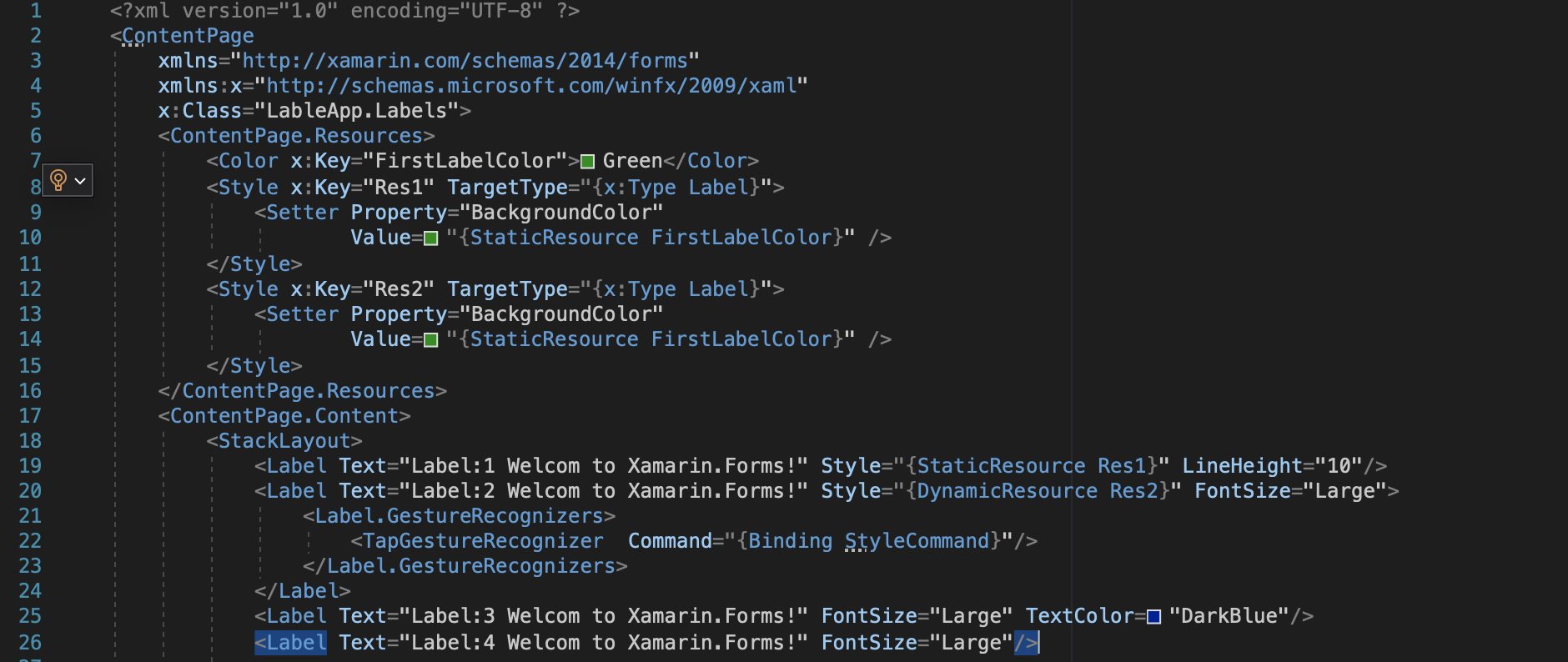 tn2>好,接下来我们开始演示。 首先都是绿色,然后点击Label2后只有Label2变红了。 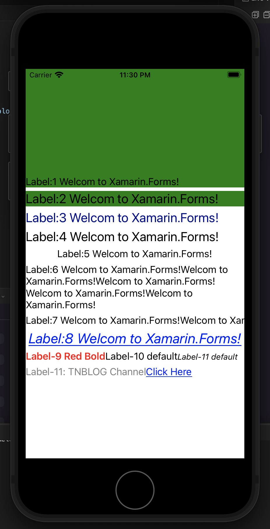 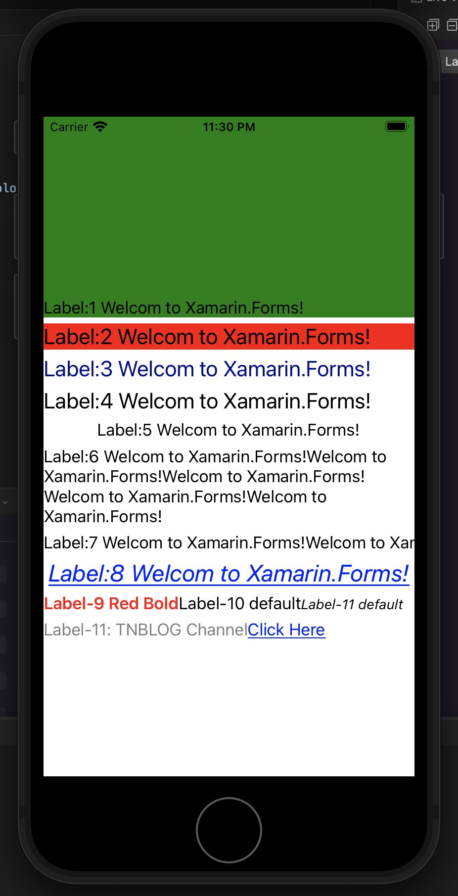 tn2>好,这是静态资源与动态资源,接下来我们来看看`TapGestureRecognizer` ## TapGestureRecognizer (点击事件) tn2>几乎在每一个标签都有点击事件,我们可以通过`<标签><标签.GestureRecognizers><TapGestureRecognizer>`来进行定义,后面结束定义就不写了。除了单击,我们还可以双击、三击、四击、无数击....等,这将取决`NumberOfTapsRequired`属性,当该属性设置为`2`就是双击,`3`就是三击以此类推。 `Command`就是后台需要触发的事件。 `CommandParameter`需要传的参数。如果要传参数的话,需要在后台的Command进行泛型实例化。 ```xml <Span.GestureRecognizers> <TapGestureRecognizer Command="{Binding TapCommand}" CommandParameter="https://www.tnblog.net/"/> </Span.GestureRecognizers> ``` ```csharp public ICommand TapCommand => new Command<string>(OpenBrowser); void OpenBrowser(string url) { Launcher.OpenAsync(url); } ```

