CSS 灯光按钮 电脑版发表于:2020/7/1 15:26 #### 效果图 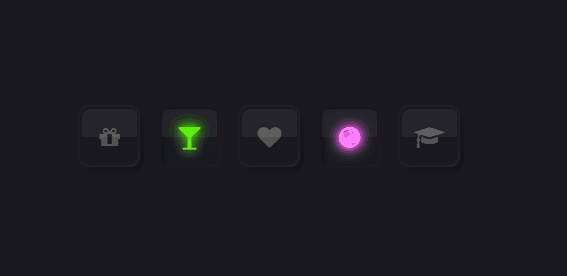 #### 代码 ><font style="color:#e67e22;font-weight:bold;">index.html</font> ```html <!DOCTYPE html> <html> <head> <meta charset="utf-8" /> <title></title> <link rel="stylesheet" href="https://stackpath.bootstrapcdn.com/font-awesome/4.7.0/css/font-awesome.min.css" integrity="sha384-wvfXpqpZZVQGK6TAh5PVlGOfQNHSoD2xbE+QkPxCAFlNEevoEH3Sl0sibVcOQVnN" crossorigin="anonymous"> <link rel="stylesheet" type="text/css" href="css/style.css"/> </head> <body> <ul> <li> <label> <input name="" type="checkbox" > <div class="icon"><i class="fa fa-gift" aria-hidden="true"></i></div> </label> </li> <li> <label> <input name="" type="checkbox" > <div class="icon"><i class="fa fa-glass" aria-hidden="true"></i></div> </label> </li> <li> <label> <input name="" type="checkbox" > <div class="icon"><i class="fa fa-heart" aria-hidden="true"></i></div> </label> </li> <li> <label> <input name="" type="checkbox" > <div class="icon"><i class="fa fa-globe" aria-hidden="true"></i></div> </label> </li> <li> <label> <input name="" type="checkbox" > <div class="icon"><i class="fa fa-graduation-cap" aria-hidden="true"></i></div> </label> </li> </ul> </body> </html> ``` ><font style="color:#f1c40f;font-weight:bold;">style.css</font> ```css *{ margin: 0; padding: 0; /* 对元素指定宽度和高度包括了 padding 和 border */ box-sizing: border-box; } body{ /* flex请参考 http://www.ruanyifeng.com/blog/2015/07/flex-examples.html */ display: flex; /*左右居中*/ justify-content: center; /*上下居中*/ align-items: center; min-height: 100vh; background: #18191f; } ul{ /* 层定位 对象不可层叠,但将依据left,right,top,bottom等属性在正常文档流中偏移位置 http://www.divcss5.com/rumen/r403.shtml */ position: relative; display: flex; } ul li{ /* 取消li默认 */ list-style: none; } ul li label{ position: relative; } ul li label input[type="checkbox"]{ /* 绝对定位 */ position: absolute; /*透明度*/ opacity: 0; /* 规则是设定网页浏览时用户鼠标指针的样式 */ cursor: pointer; } ul li label .icon{ position: relative; width: 60px; height: 60px; background: #18191f; color: #555; font-size: 24px; display: flex; justify-content: center; align-items: center; cursor: pointer; margin: 0 10px; border-radius: 10px; /* 内容溢出就隐藏 */ overflow: hidden; /* 元素添加阴影 推荐网站:https://neumorphism.io/#55b9f3 */ box-shadow: -1px -1px 4px rgba(255,255,255,0.05), 4px 4px 6px rgba(0,0,0,0.2), inset -1px -1px 4px rgba(255,255,255,0.05), inset 1px 1px 1px rgba(0,0,0,0.1); } ul li label .icon:before{ content: ''; position: absolute; top: 2px; left: 2px; width: calc(100% - 5px); height: calc(50% - 2px); border-top-left-radius: 8px; border-top-right-radius: 8px; background: rgba(255,255,255,0.05); } ul li label input[type="checkbox"]:checked ~ .icon{ box-shadow: inset 0px 0px 2px rgba(255,255,255,0.05), inset 4px 4px 6px rgba(0,0,0,0.2); } ul li label input[type="checkbox"]:checked ~ .icon .fa{ color: #00f3ff; text-shadow: 0 0 15px #00f3ff, 0 0 25px #00f3ff; animation: animate 5s linear infinite; } @keyframes animate{ 0% { filter: hue-rotate(0deg); } 100% { filter: hue-rotate(360deg); } } ```

