
div 自适应高度,自动填充剩余高度
电脑版发表于:2019/10/31 17:27
方案1:
<div class="outer">
    <div class="A">头部</div>
    <div class="B">下部</div>
</div>
样式:
html,
body { height: 100%; padding: 0; margin: 0; }
.outer { height: 100%; padding: 100px 0 0; box-sizing: border-box ; position: relative; }
.A { height: 100px; background: #BBE8F2; position: absolute; top: 0 ; left: 0 ; width: 100%; }
.B { height: 100%; background: #D9C666; }
方法2:
<div class="outer">
    <div class="A">头部</div>
    <div class="B">下部</div>
</div>
样式:
html,
body { height: 100%; padding: 0; margin: 0; }
.outer { height: 100%; padding: 100px 0 0; box-sizing: border-box ; }
.A { height: 100px; margin: -100px 0 0; background: #BBE8F2; }
.B { height: 100%; background: #D9C666; }
配合Layui实现如下的布局:
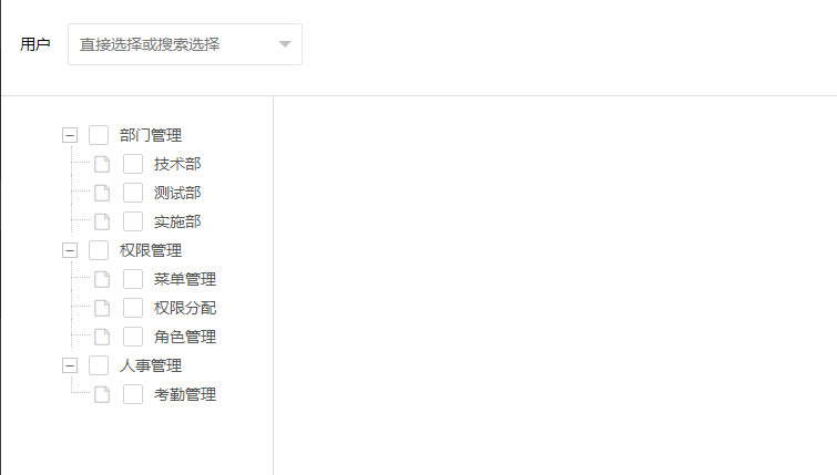
结构差不多就是这个样子
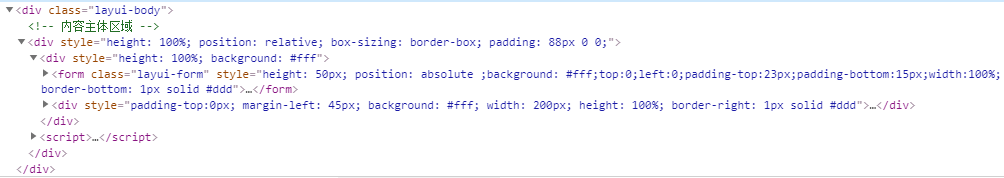
这里说一下,最外面的padding:88是因为,下面的高度50+padding-top的23+padding-bottom的15 = 88
还有那个树形的菜单要想写个距离顶部的间距就在div里边在加一个在写不然就影响到高度自适应的

